Data Visualization Techniques Transforming Real-Time Choices in Multi-Event Live Betting
Hugo Russell · Jun 28, 2026
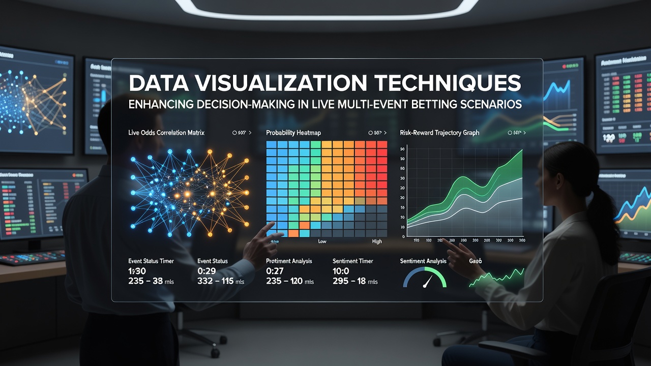
Data Visualization Techniques Transforming Real-Time Choices in Multi-Event Live Betting
Live multi-event betting requires rapid processing of shifting odds, player statistics, and game developments that unfold across several matches at once, and data visualization techniques provide structured ways to organize this information into accessible formats that support clearer assessments. Platforms present complex datasets through interactive charts, timelines, and correlation maps that allow observers to track patterns without sifting through raw numbers, while real-time updates keep visuals aligned with unfolding action in leagues such as the NBA, MLB, and NFL during overlapping schedules.
Core Visualization Methods Applied to Simultaneous Markets
Heatmaps highlight probability distributions across different betting options, showing where value concentrates as odds adjust during live play, and these graphical representations help identify clusters of activity in one event while monitoring another. Line graphs track momentum shifts by plotting performance metrics against time, enabling side-by-side comparisons that reveal divergences between two contests happening concurrently, whereas scatter plots illustrate relationships between variables like possession time and scoring efficiency across multiple games.
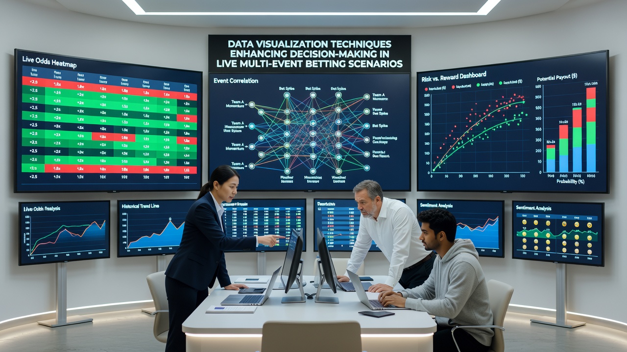
Dashboard layouts combine several elements into single views that display odds movement, historical benchmarks, and predictive overlays, so users can monitor an MLB inning alongside an NBA quarter without switching screens. Researchers at institutions focused on sports analytics have documented how such integrated displays reduce the time needed to interpret live data streams, particularly when events span different time zones and require continuous attention through June 2026 schedules.
Handling Overlapping Events with Layered Graphics
Multi-event scenarios often involve simultaneous wagers on games with varying paces, and visualization tools address this by layering data streams into synchronized animations that update without manual refresh. Tree maps break down team compositions or statistical categories into proportional blocks, allowing quick scans of depth across rosters in separate matches, while flow diagrams trace how specific events, such as a goal or turnover, propagate through betting markets in connected competitions.
Those who study betting platforms note that color-coded alerts within these visuals flag significant deviations from expected ranges, drawing attention to moments when one contest's developments might influence pricing in another through league-wide trends or player carryover effects. This approach proves especially useful during condensed calendars when multiple fixtures overlap on weekends or midweek slates.
Integration with Predictive Models and Historical Context
Visualization techniques frequently incorporate outputs from statistical models that project future states based on current conditions, rendering these projections as confidence intervals on graphs rather than isolated numbers. Bar charts compare live performance against seasonal averages for athletes participating in different events, highlighting outliers that could affect live lines, and animated transitions show how these comparisons evolve as new data arrives.
According to reports from the American Gaming Association, adoption of such visual tools has grown alongside expanded digital access to live markets, with platforms incorporating elements like geographic maps that plot weather impacts or venue factors across concurrent games. Industry analyses from sources such as the European Gaming and Betting Association further indicate that these features support more structured evaluations when bettors manage positions in several sports at once.
Practical Applications in Live Settings
During extended evenings of overlapping contests, timelines allow users to align key moments from different games on a shared axis, revealing how developments in one might coincide with opportunities in another. Network graphs depict connections between variables such as team fatigue indicators and line movements, providing context that static tables cannot convey as effectively in fast-paced environments.
Observers tracking June 2026 betting volumes have pointed to increased reliance on these methods amid higher participation in multi-sport promotions, where visuals consolidate information from disparate sources into unified interfaces. This consolidation helps maintain awareness across events without requiring constant manual cross-referencing of separate data feeds.
Conclusion
Data visualization techniques continue to evolve as platforms refine their ability to handle the volume and velocity of information generated by live multi-event betting, offering structured pathways for interpreting dynamic conditions across concurrent competitions. These tools organize statistical inputs, model outputs, and market responses into formats that facilitate ongoing evaluation, supporting decisions grounded in visible patterns rather than isolated observations. As schedules and market offerings expand, the role of layered graphics and interactive displays remains central to managing complexity in real-time wagering environments.